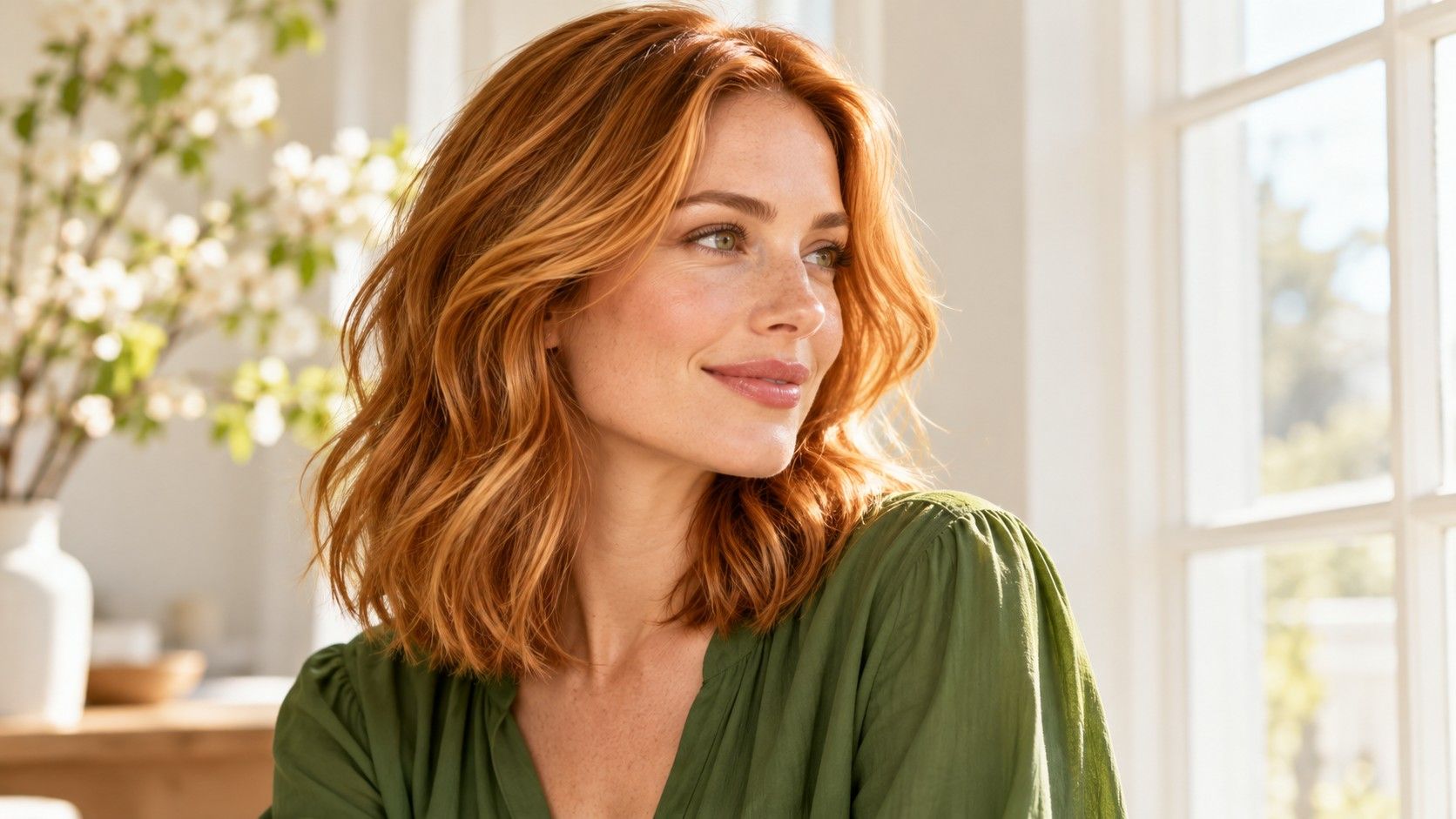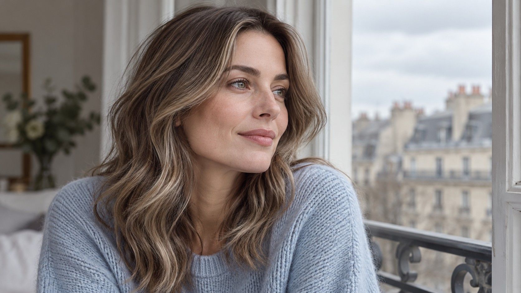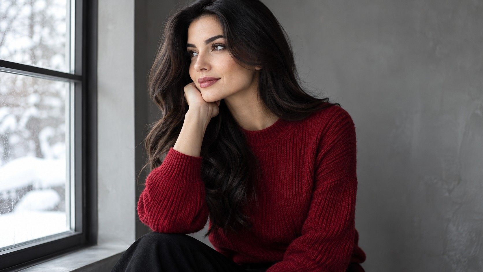
If you already enjoy a Winter palette in your clothes, a hair change can alter how that familiar wardrobe feels. Darker hair may give a white shirt a stronger frame; lighter pieces may soften the outline near your face. Use those observations to explore a direction rather than to obey a list of approved shades. Choosing hair color for a Winter palette works best when depth, tone, placement and everyday upkeep are considered together.
Decide what your Winter palette is helping you choose
“Winter skin tone” is seasonal-style shorthand, not one literal skin color. A Winter label does not mean everyone has pale skin, dark eyes or the same natural hair. Its practical role is to help describe the visual qualities you enjoy and arrange useful comparisons.
Start with the pieces you actually wear. Perhaps you like the clean contrast of navy and white, saturated jewel-colored knitwear or a sharp black neckline. Ask what you want your hair to do beside those clothes. You may want a stronger outline, less visible warmth, brighter sections or simply a color that demands fewer changes to your normal makeup.
These are separate preferences. A person who likes a crisp wardrobe might still prefer medium-depth hair with gentle variation. Someone else might enjoy a very dark base against a bright collar. Keep the decision attached to the effect you can see.
If you are uncertain about the seasonal label itself, you can still do the comparison. Write down two things you like about your current hair and one thing you want to change.
Test three familiar outfits before replacing your hair color
Choose three tops you wear often: one light neutral, one darker neutral and one stronger color. Wear them near the same window, with your hair in its usual shape, and take plainly lit photographs without a beauty filter.
Look at how much contrast appears around the face in each outfit. A pale neckline beneath dark hair may make the outline more prominent. A dark neckline can merge with dark lengths and change their apparent shape. Notice the overall arrangement before deciding whether the hair itself needs changing.
Use the same edited hair options across the three photos if you have a suitable preview tool. Keep the face untouched and the exposure steady. A shade that works with only one carefully chosen outfit may be less appealing in a daily wardrobe. That does not rule it out, but it helps you decide whether you want to adjust clothes or makeup along with the hair.
Do not turn this into a skin diagnosis. A colored top can reflect light onto your chin, while camera adjustments can alter skin and hair together. If one comparison looks surprising, repeat it with softer daylight and a less reflective neckline. The point is to understand your preferences in familiar settings, not prove that one color makes everybody look healthier.
Compare depth and tonal family in separate rounds
Depth means how light or dark hair appears. Tone describes its color character, such as neutral, golden, copper or ash. Begin with a depth comparison: something close to your present hair, a deeper option and a lighter option. Then explore tone within the range you prefer. This keeps a dramatic brightness change from deciding the warm-versus-cool question for you.
Cool brown and black are useful comparisons when you want a clear frame. Examine whether the brown remains visible in ordinary light or only in a bright reflection. Black may feel much denser beside your face. If the darker result is too strong, that says something about your preferred depth; it does not prove that all cooler tones are unsuitable.
| Color direction | What to compare with your wardrobe | Detail to specify |
|---|---|---|
| Neutral or cool-looking brown | How much definition remains beside dark clothes | Visible brown dimension and preferred warmth |
| Black or near-black | The strength of the outline beside light necklines | Natural-looking depth or a more pronounced color reflection |
| Lighter brown or blonde | Whether you enjoy the reduced dark frame | Root depth and where the lightness begins |
| Expressive red, violet or blue direction | How the hair works as another strong color | The amount and location of visible color |
A fashion color is a personal styling choice, not a requirement of a Winter palette. Compare it with the clothing colors you wear most rather than assuming that every intense shade will work the same way.
Shade names are a starting vocabulary. “Espresso,” “icy” and “neutral blonde” can describe quite different photographs. When searching for the best hair color for Winter skin tone, look past the name and identify the visible feature you want: a darker root, a less golden length or a bright edge beside the cheek.
Place brightness where you want the contrast
Highlights change more than the average lightness of your hair. Their placement determines where the eye sees contrast. A broad lighter piece beside the face creates a different result from fine pieces farther down the lengths. If you want to retain a dark frame, show a reference with enough base color still visible near the forehead and cheeks.
Look at the style from the front and a slight angle. A beautiful rear view may conceal a very bright front section, or a front photo may hide how light the back becomes. Compare the amount of brightness you can see with the way you usually wear your hair.
Consider your everyday texture too. Straight, wavy and curly arrangements can show the same placement differently because strands overlap and light falls unevenly. Ask for references that make the placement understandable rather than expecting an identical photographic effect on a different style. The relevant question is where the lighter areas will appear on your own hair.
A virtual preview may paint the whole head evenly and miss this distinction. Use it for a broad brightness test, then add an actual placement reference for the consultation. Label the part that matters. “Keep the root deep and place brightness lower down” is clearer than asking for a general Winter highlight while showing an image whose root is cropped out.
Let your starting color set the practical questions
Compare your natural root color with the dyed or lightened lengths in indirect daylight. Record the difference and bring a simple history of previous color services. Include approximate dates and whether each affected the full head or selected sections.
A screen can replace dark hair with pale color immediately. It cannot show how your actual hair will reach that appearance, whether several stages could be involved or what compromises may be useful. Ask a colorist which feature of the reference can be preserved if the exact result is unsuitable. The answer might concern depth, placement or the amount of visible brightness.
Upkeep belongs beside the appearance decision. Tell the colorist whether you dislike a sharp root line, prefer longer gaps between appointments or are particular about the tone through the ends. Ask how the chosen result could change as it wears and what follow-up work might be expected. Request an estimate based on your own hair and goals.
There is no single maintenance schedule for hair colours for Winter skin tones. A close-to-current option and a large change can involve very different practical decisions. If the suggested routine does not suit you, revisit the same visual idea with a more compatible base or less extensive placement. Keep the part of the look you value most in view.
Take a wardrobe-aware shortlist to the consultation
Bring three labeled references rather than a gallery of every Winter shade you have found. Choose one near your present depth, one showing the change you favor and one boundary example that goes too far. Add your daylight photo in an ordinary outfit. Explain whether the priority is cooler tone, stronger definition, brighter sections or a different relationship with your clothes.
If a virtual option looks appealing, keep its original beside it. Tell the colorist which part is useful and where the tool was inaccurate. A painted hairline or altered complexion is a reason to qualify the image, not something a real service should be expected to reproduce. Ask to compare shade references and discuss the result in ordinary light.
Leave space for an alternative. A slightly different depth or a narrower light section may preserve the contrast you wanted while better fitting the starting hair and your routine. You can assess that suggestion with the same three outfits and the same written preferences.
For home color, follow the product directions and required safety instructions. A palette chart cannot specify chemical steps, mixtures or processing decisions. Keep your final notes focused on the finish: depth range, tone, placement, acceptable regrowth and upkeep. Those details give your Winter-inspired choice a practical shape you can return to later.