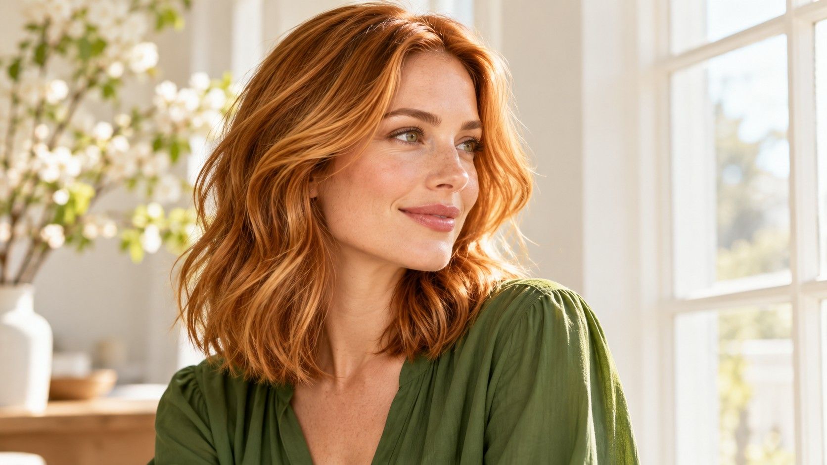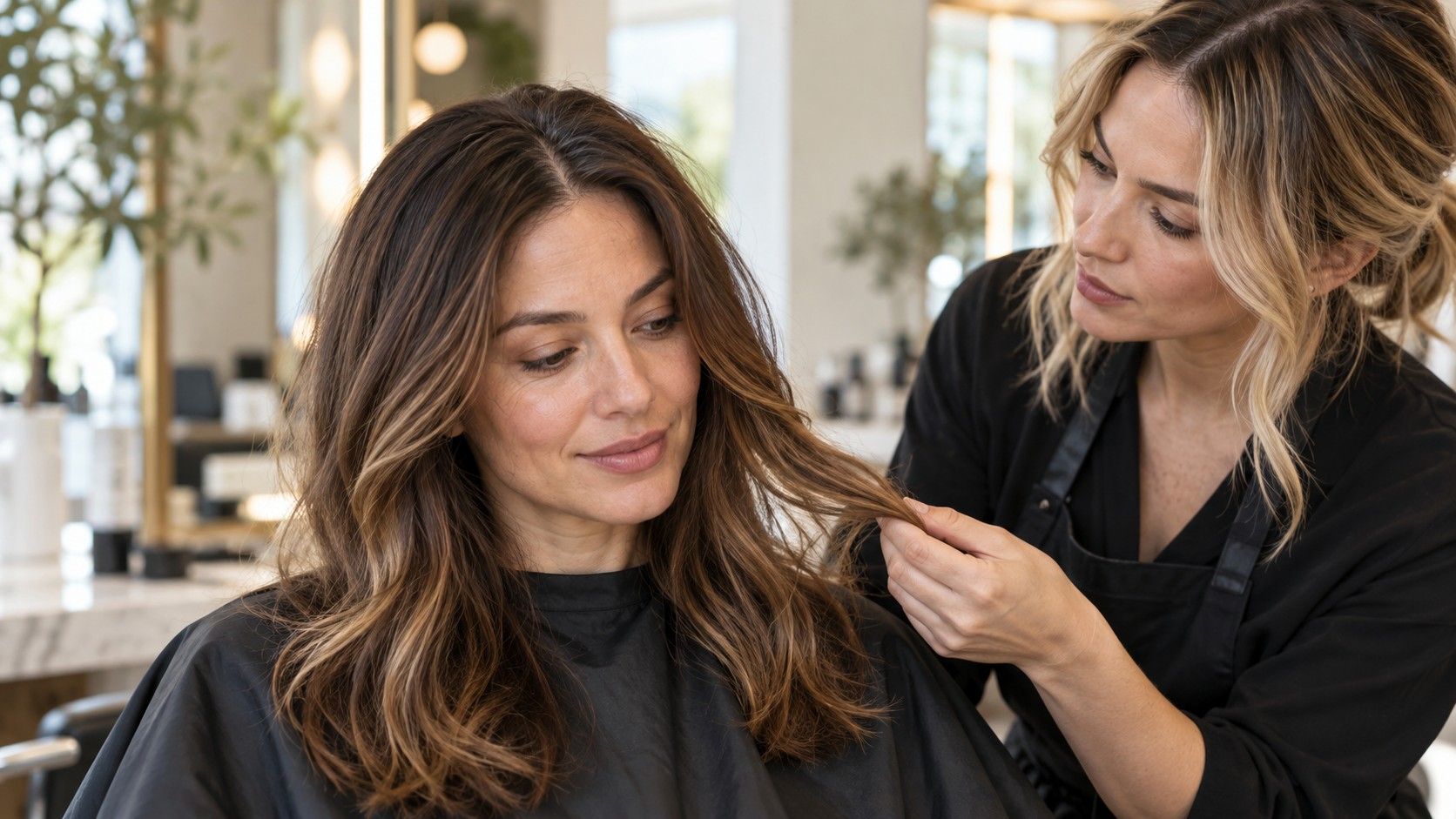
Searching for cool summer hair colors often produces two very different ideas: icy blonde and smoky brown. Both can belong in the conversation, but they will not give you the same overall look. The useful work is deciding how cool, how light and how contrasted you want your hair to appear. Seasonal palettes offer a vocabulary for that comparison. They are subjective styling frameworks, so use the label to narrow your experiments while keeping your own preferences in charge.
Separate “cooler” from “lighter” before you compare
Coolness describes a color direction; depth describes how light or dark the hair looks. A deep neutral brown can appear less golden than a light beige blonde without becoming an icy shade. If you change both qualities in one preview, it is difficult to tell which change you like. Begin with two versions at a similar depth, then compare a lighter and a deeper variation of the winner.
Use your existing roots as a reference, especially if your lengths have been colored. The ends may reflect old highlights, fading or several different applications rather than your current natural color. A photograph taken near a window can help you see the difference, but it does not replace an in person assessment. Avoid choosing from a sunlit picture alone: reflected warm light can make an otherwise neutral brown look golden.
Cool Summer is usually described in seasonal styling as a cool leaning, relatively soft palette. Interpret that as an invitation to compare quiet cool shades. It does not mean that you must become pale blonde, conceal every warm reflection or wear a particular darkness. If you enjoy a stronger outline around the face, include a deeper option in your test. Your preferred level of contrast is a separate choice.
For brown hair, test neutral cocoa before going very dark
A cool brunette can feel like a modest adjustment when you already have brown hair. Useful references include neutral cocoa, smoky brown and a soft ash brown with subtle variation. These names are loose descriptions; one person's cocoa is another person's warm chocolate. Compare the photographs themselves and describe the feature you want, such as less visible orange through the mids or a softer transition from roots to lighter ends.
Very dark brown can look beautifully deliberate, yet it changes the face frame more than a small adjustment in tone. In a preview, check whether you still see separate strands and highlights beside the cheeks. If the hair reads as one dense block, try a slightly lighter brunette with a similar cool direction. You may want dimension rather than an overall move toward black.
Choose references with a comparable haircut and styling. A smooth bob displays a dark perimeter differently from a layered cut with waves. Fine highlights that blend in motion may look more distinct when the hair is straight. Show your colorist the amount of variation you want, including whether the front should stay close to the base. “Cool brown with quiet lighter pieces and a medium depth” gives a more practical starting point than a season name alone.
For blonde hair, compare pearl, beige and ash honestly
Cool blonde is a broad category. Pearl may suggest a silvery or softly violet impression, ash a gray leaning impression and beige a more neutral balance, but those labels vary across reference images and salon color ranges. Keep examples together in one view so you can compare what you actually see. Do not assume that the coolest sounding name will be the most flattering option.
Ask how light you want the hair to feel at the roots as well as at the ends. A light beige blonde with a softly blended root can create a different face frame from an evenly pale pearl blonde. If your brows are deeper, decide whether you like that contrast or would prefer a gentler transition. Brow depth alone does not establish the right answer; it simply changes the combination you are viewing.
Try the preview with the hairstyle you wear on busy mornings. A pale color in a carefully curled reference photo may look quite different tied back, when the roots and front sections dominate. If the virtual shade seems gray and flat, compare a neutral beige at the same lightness before abandoning blonde. You may like the depth and dislike only the strong ash effect. Take both images to the consultation so that distinction stays clear.
When your current hair is warm, plan from its history
If your lengths are copper, golden or red, a cool reference image cannot tell you what changing them will involve. Previously applied color, uneven ends and different bands through the length all matter to the plan. A preview paints over those details. It may make a major shift appear as straightforward as a small tonal adjustment, which is why the practical consultation needs more than the edited image.
Bring a simple account of your recent color history, including home color if you have used it. Show the hair in ordinary daylight and explain whether your priority is less warmth, a darker result or an overall lighter look. Ask the colorist to separate the immediate options from a possible longer transition. A less ambitious neutral result may be a better first choice if you prefer a manageable change.
A reference can contain features you want to keep even when its exact color is impractical. You might like the soft root, the fine highlights or the fact that the ends are not much lighter than the front. Identify those features individually. This allows a stylist to discuss an achievable version instead of treating the picture as a fixed formula. Avoid judging the plan by how closely a phone overlay can copy it.
Check the shade beside your face in consistent conditions
The familiar search for the best hair color for a Cool Summer skin tone suggests there should be one answer hidden in a palette. In practice, people prefer different balances of softness and contrast, and photographs introduce their own distortions. A useful test keeps the face, clothing, lighting and camera settings as consistent as possible while you change the hair option.
Take a reference photo facing indirect daylight with a neutral expression and your usual parting. If you are comfortable doing so, use minimal makeup for one comparison so you can see how the combination feels without a coordinated lip or blush. Then check with the makeup you normally wear. Neither version is a more valid identity test; they answer different questions about everyday use.
| What you notice | What to compare next | What to keep steady |
|---|---|---|
| The shade looks too severe | A lighter depth or softer contrast at the front | The same cool or neutral direction |
| The hair looks dull or gray | A more neutral version with visible dimension | Approximate lightness |
| You like the color only in bright daylight | The same shortlist in an indoor photograph | Clothing and hairstyle |
| You like the ends but dislike the face frame | A deeper root or quieter front highlights | The overall color family |
Look at the whole image before studying small skin details. Automatic exposure and white balance can shift the appearance of the face, so a slightly brighter complexion in one render is weak evidence. If the tool changes your facial features, compare with another photograph or discard that result. The test should help you recognize a preference, not diagnose an undertone.
Choose the version you are willing to maintain
The best hair color for a Cool Summer palette is still a poor choice if its upkeep frustrates you. Discuss how the proposed shade is likely to look as roots appear and the tone changes between appointments. Exact timing depends on your hair, the work performed and the result you want to preserve. Ask for a realistic maintenance plan based on the proposed service rather than adopting a universal interval from an online guide.
Explain what “easy” means in your routine. You might be happy with natural roots but dislike a noticeably warm fade. Someone else may welcome a slight change in tone while wanting an even root area. Those are different priorities. A softly blended brunette and a very light cool blonde can demand different compromises even if both fit the same set of seasonal references.
Finish with a short request: one main image, one alternative and one example you dislike. Note the depth you want, the strength of the cool effect, the amount of dimension and the grow out pattern you can accept. For example, you might request a medium cool brown with fine lighter pieces while ruling out a flat charcoal look. That is a specific, discussable goal. The palette has done its job once it helps you describe a choice you want to wear.