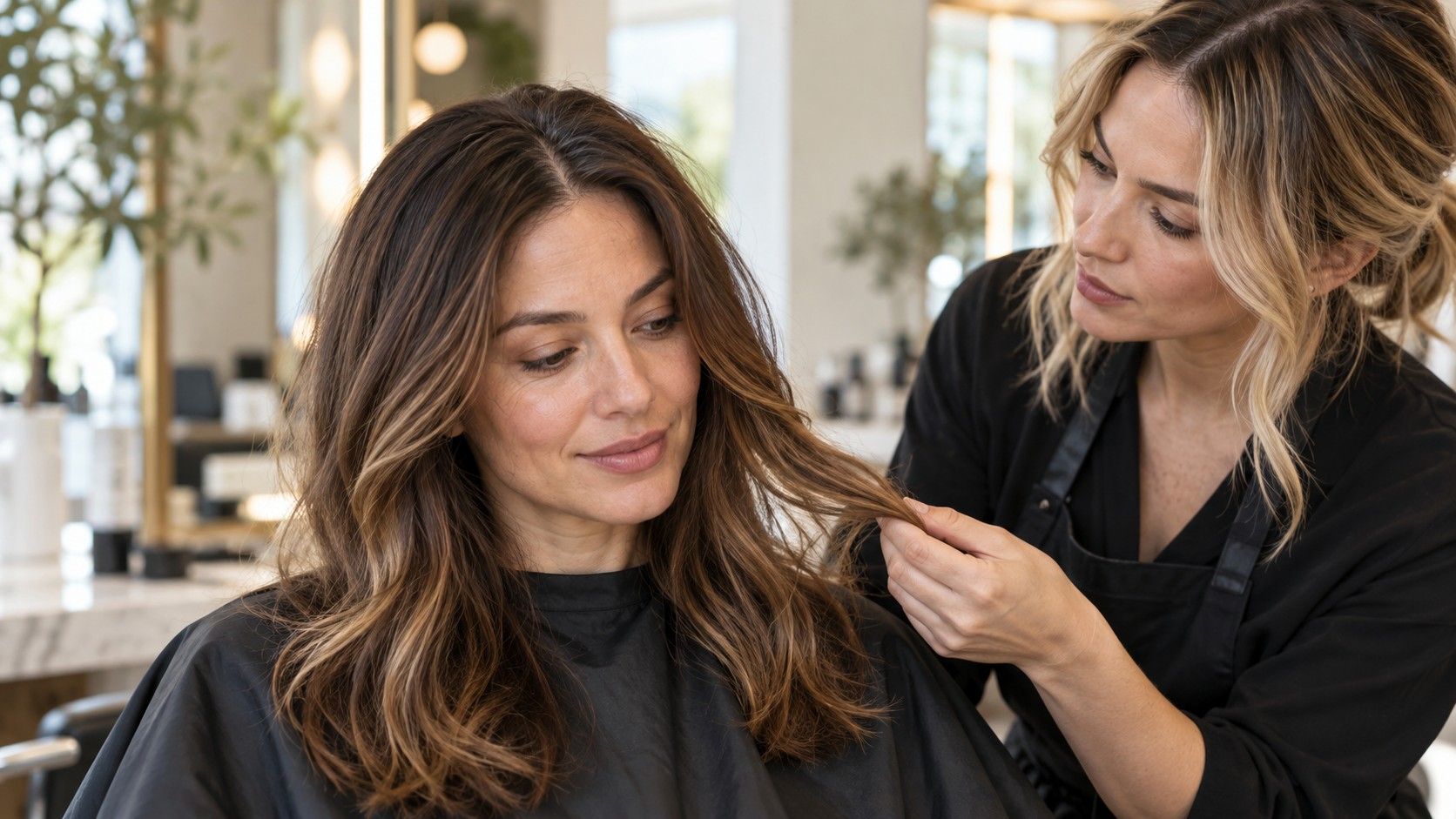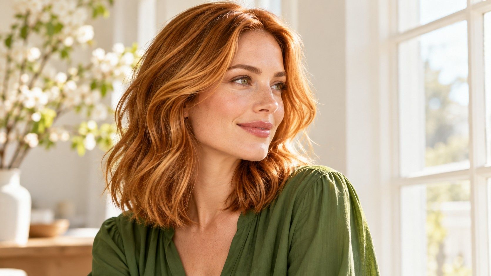
A bright copper photograph can make a hair change feel obvious until you place it beside your own face. Perhaps you like the energy but not the orange intensity, or the golden highlights but not the pale ends. Bright Spring hair colors are a useful place to explore that distinction. In seasonal styling, the palette is commonly associated with warmth and clarity. Treat those qualities as creative directions, then decide how much brightness and contrast you want in your everyday hair.
Find out whether you want brighter color or lighter hair
Brightness in this context is about a clear, lively impression. It does not always mean going blonde. A medium golden brown can look vivid and defined, while a very pale blonde can look soft and quiet. Before selecting a shade, decide whether your current color feels too dark, too muted or simply lacking variation. Each complaint points to a different comparison.
Start with your current depth and compare a neutral brown with a clearer golden brown, or a beige blonde with a brighter gold. Then try a lighter version of whichever you prefer. Keeping those steps separate makes the result easier to read. If you change depth, warmth and highlight placement together, a striking preview may leave you unsure which part you actually want.
A season label cannot determine your ideal saturation. Some people enjoy a noticeable copper statement; others want a small warm reflection that appears when their hair catches the light. Both are reasonable experiments. Save a photograph of your existing hair in indirect daylight so every new option has a stable reference. A ring light or a strong beauty filter can make nearly any color look clearer than it will in ordinary surroundings.
Compare golden brunette with copper before choosing red
If you already have brown hair, put a golden brunette and a copper brunette side by side. The first can keep a recognizably brown base with warmer reflected light; the second makes red orange more central to the overall look. That distinction matters when you like copper in a mood board but hesitate at the thought of seeing it beside your face every morning.
Use a reference that shows the hair both in shade and near a window. A dark copper may look almost brown indoors and much redder outside, whereas a brighter copper can remain visibly red in several kinds of light. Captions rarely tell you enough. Look at the front sections, crown and ends, and ask whether the warmth is distributed evenly or concentrated in highlights.
For a smaller change, consider the effect of warm pieces through an existing brunette rather than immediately choosing an all over red appearance. Fine golden highlights and a pronounced copper face frame create different amounts of contrast. You can like the first and dislike the second without contradicting your seasonal palette. Describe the result visually: a clear golden reflection, a brown root that stays visible, or copper that reads as copper indoors.
Keep a blonde comparison from becoming a wash of pale color
Golden blonde, warm beige and strawberry blonde offer distinct ways to explore a brighter look. Compare them at similar depths first. A strawberry example that is much darker than your gold example tells you little about whether you prefer a pink copper direction. Color names are inconsistent, so choose photographs that show the actual balance you want rather than relying on the word attached to them.
Pay attention to the boundary between your forehead and the hairline. If a pale preview seems to erase the shape of the hair around your face, try a little more depth at the root or a stronger golden impression before concluding that blonde is wrong. If the same preview feels fresh and deliberate, that preference matters too. There is no universal rule that a particular complexion must have a dark outline.
Check the look with your usual part and a simple hairstyle. In a ponytail, the roots and hairline may matter far more than the light ends visible in a reference image. A dramatic front highlight can dominate a short cut but become one small part of a long layered style. Choose references that make the placement clear, including one with the hair pulled back if that is how you often wear yours.
Decide how much root contrast you want to see
A darker root can make warm highlights look sharper, but a strong boundary is a separate design choice from the shade itself. Compare a softly blended root with a more defined one using the same general color family. In one version, your eye may travel through the whole head of hair; in the other, the contrast at the crown may become the feature you notice first.
Your natural root color provides a practical reference for grow out. If you want less visible change as it returns, ask what keeping the root area near that depth could look like. If you love a pale or vivid all over effect, include the root upkeep in your discussion. Neither approach is inherently more flattering. The useful question is whether you like the contrast both immediately after an appointment and as the color grows.
Brows also affect the picture, but they do not need to match the hair. Use a preview with your actual brows visible and resist changing several facial features at once. You may enjoy the crispness of deep brows with bright gold, or prefer a warmer brunette that reduces the difference. Keep one image of each possibility. That is more useful than adjusting every element until the software creates a face you do not usually see in the mirror.
Test clarity in your wardrobe and ordinary lighting
The best hair color for a Bright Spring palette cannot be established by a seasonal chart alone. Those charts are subjective style systems, and their category boundaries differ. A bright shade may appeal to you because it adds energy to your clothes, while a gentler shade may be easier to wear on a day when you want little contrast. Make room for both responses in the comparison.
Try the shortlist beside two tops you already wear frequently. A clear green or warm red might show how much impact the combined colors create; a familiar neutral can show whether you enjoy the hair when it carries most of the color. Avoid buying a new wardrobe to make an untested shade seem convincing. Begin with the life and clothing you already have.
Take one daylight photograph and one indoor photograph without a filter. Use the same crop for each hair option, and leave the camera exposure alone if the app allows it. If one render also makes your skin brighter or changes your facial proportions, treat the comparison cautiously. You are choosing a hair direction, and an attractive edit does not prove that the color is achievable on your starting hair.
Notice how specific your preference becomes. “The golden brunette works in both rooms, but this copper feels too intense with my red coat” is actionable. “The app says Bright Spring” leaves the actual hair decision unresolved. Your observations carry more weight than the certainty of a category result.
Bring a clear target and a realistic maintenance preference
Before a consultation, select one main reference and one quieter alternative. For example, the main choice might be a clear copper brunette, with a golden brown that keeps more of your existing depth as the alternative. Add a photograph you dislike and explain the reason: too orange at the front, too much difference between roots and ends, or too pale overall. This gives your colorist several useful boundaries.
Your starting color and previous dye affect what can be proposed. Dark colored lengths, old lightened pieces and untreated hair require individual assessment. Tell the colorist what has been done rather than expecting a preview to reveal it. Ask which parts of the reference are realistic now and what a more gradual version would preserve. The software is useful for seeing a mood, but it cannot evaluate the hair's condition or its color history.
Discuss how the proposed warmth and clarity are likely to change between appointments. Ask about the expected appearance as it fades, the root transition and the upkeep involved in keeping the particular result you choose. Avoid assuming that a bright copper and a golden brunette will fit the same routine. If you prefer fewer appointments or are happy with some change in tone, say so before the plan is settled.
A useful final request names the shade family, approximate depth, highlight placement and amount of contrast. You might want a warm medium brunette with clear gold through the lengths and a softly blended root. Or you might choose a vivid copper with a stronger face frame. Either way, Bright Spring has served its purpose when it helps you explain a color you want to wear, with practical expectations about getting there.