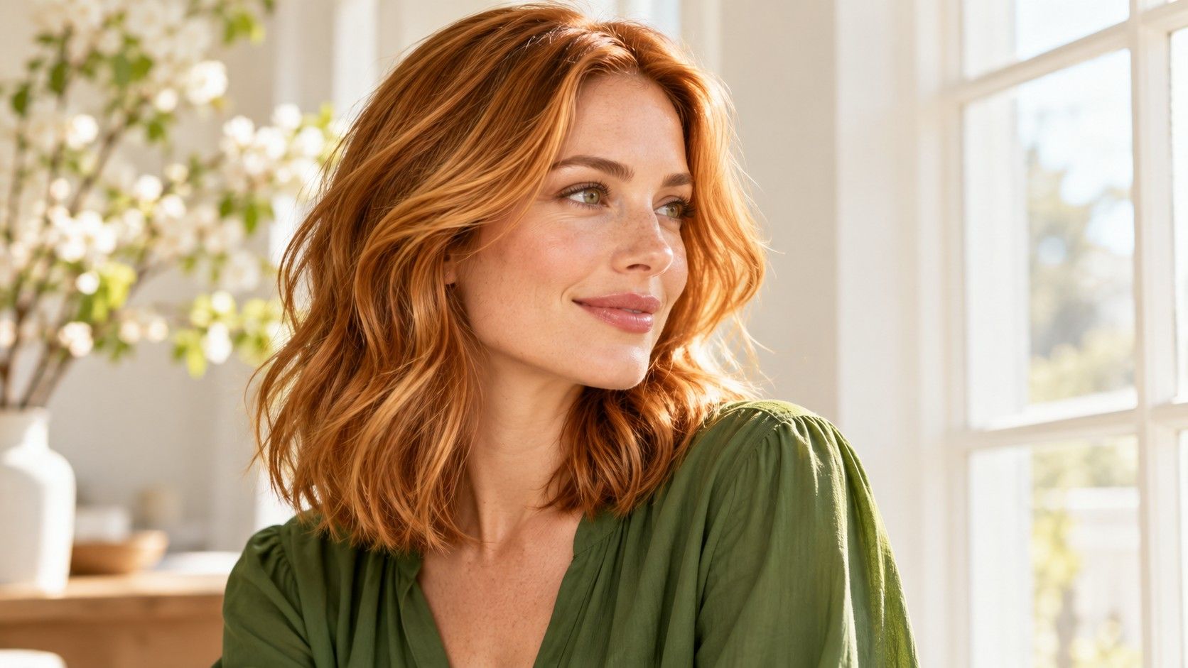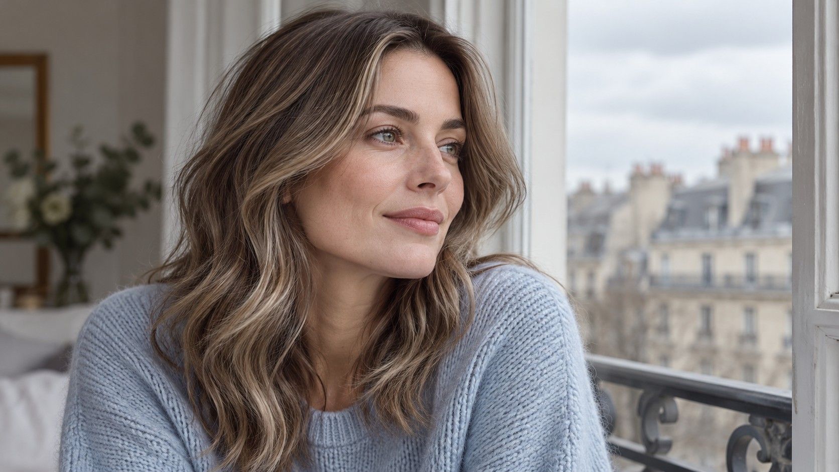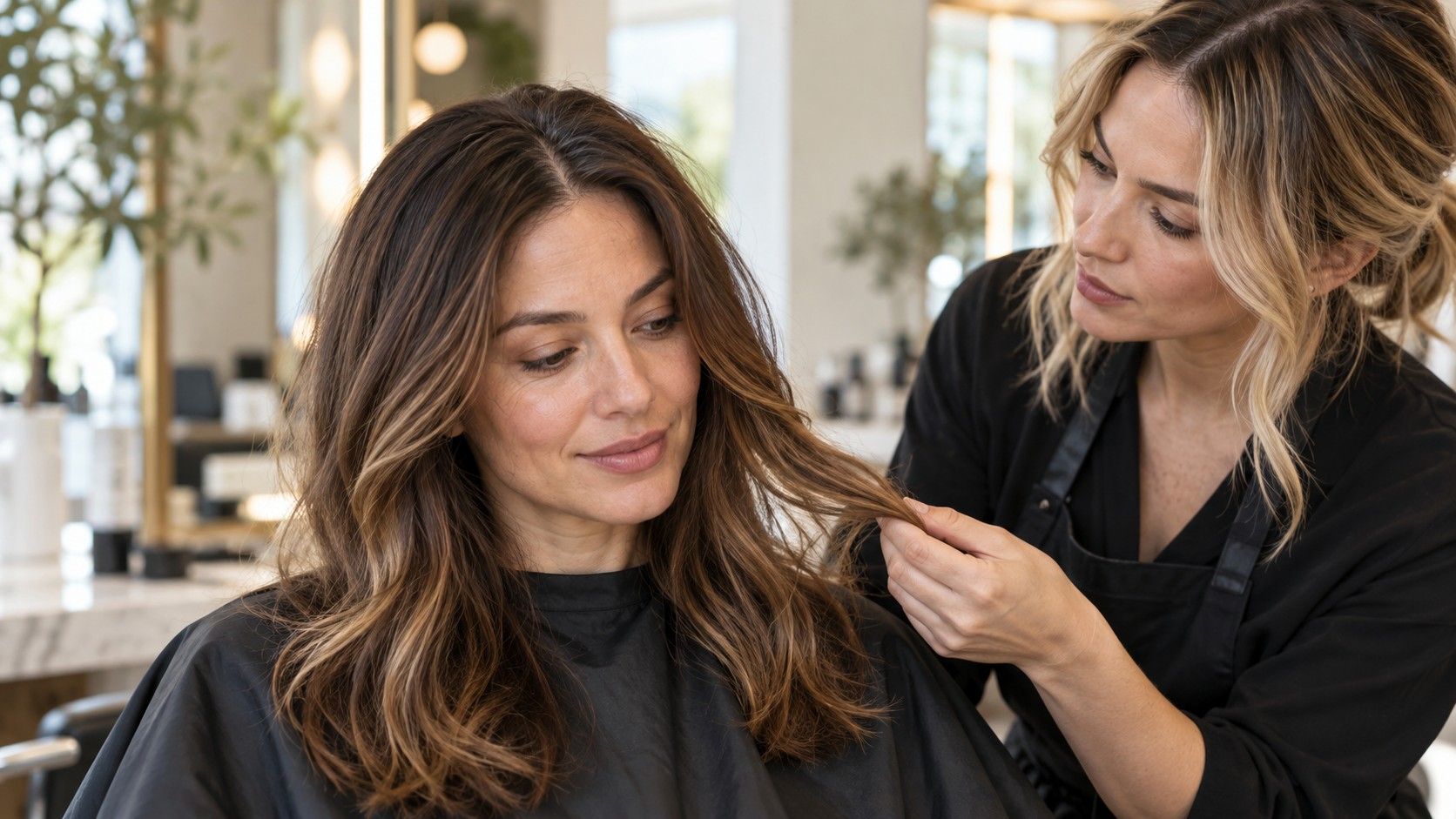
A hair color can look beautiful on a reference photo and feel wrong the moment it sits beside your own face. Hair color analysis gives you a way to investigate that reaction. Start with the depth and tone of your current hair, compare a few controlled alternatives, then check the practical work behind them. The useful result is a small set of choices you can explain, with enough detail for a colorist to discuss what is achievable.
Start with the roots and the color already in your hair
Separate your natural hair depth from the color through the lengths. Depth describes how light or dark hair appears; tone describes its color character, such as golden, copper, ash or neutral. Two browns can have a similar depth yet give quite different impressions because one leans red and the other looks cooler.
Look at visible regrowth in even daylight if you have it. A dark root beside lightened ends is useful information, not a flaw to crop out of the photo. Record the contrast between them. If your hair is completely covered by dye, describe the current result honestly and tell the colorist that your natural base is uncertain.
Write down previous permanent color, lightening and other color services as accurately as you can. Include approximate dates and whether treatments affected the whole head or selected sections. A photo can show the appearance of existing hair, but it cannot reveal that history. The same inspiration shade can involve very different salon work on untouched hair and on hair with several layers of previous dye.
Keep your starting description short: “dark brown regrowth, warmer medium-brown lengths, old lighter pieces around the face.” That is more informative than a box shade name alone. It also prevents an analysis test from treating your current dyed color as proof of your natural coloring.
Test warm and cool tones without changing everything else
Use a photo taken near a window in indirect daylight, with light falling evenly across your face and hair. Strong sun creates bright patches; a warm lamp can make a neutral brown appear coppery. Remove obvious beauty filters and avoid an image with a deeply shaded face. You are looking for a fair comparison, not the most dramatic photograph.
Begin with two shades at roughly the same depth. Compare a warmer medium brown with a cooler medium brown before comparing either with pale blonde. Otherwise the jump in brightness can overwhelm the difference in tone. Ask a precise question: does the hair look separate from the face, does the overall contrast feel comfortable, and is the color something you would enjoy wearing with ordinary clothes?
Undertone is one possible clue, but no single vein, jewelry or photograph test should settle the decision. Surface redness, makeup, surrounding colors and the camera's interpretation of light can change what you notice. If a warm-versus-cool comparison is inconclusive, include a neutral option. You do not need to force a clear seasonal label before you can choose a useful brown or blonde.
Repeat the comparison with another evenly lit photo before rejecting an entire color family. A shade that looks dull in one shadowed image may look quite different when the face is properly exposed. When two photos disagree, reduce your confidence in the test. Save the uncertainty as a question for the consultation instead of repeatedly adjusting filters until they deliver a preferred answer.
Check the contrast at your face, not just the swatch
A swatch gives no reliable sense of how much hair will frame your skin. Compare the whole head, including roots, fringe and the pieces nearest the cheeks. A deep brown block around the face creates a different arrangement from the same brown with lighter face-framing pieces. Placement can explain why you like a color on someone else without wanting that exact treatment on yourself.
Notice the relationship between hair, brows and eyes without expecting them to match. Dark brows do not prohibit lighter hair, and light eyes do not require blonde. The decision is about the amount of contrast you want to see. If very dark hair makes every other feature feel faint in the preview, compare a slightly softer depth before discarding the tone itself.
For a practical check, view each option at the same size and put your original photo beside it. Then step back from the screen. A dramatic change may be exciting when enlarged but feel too strong as an everyday overall look. Keep your normal makeup in mind: a shade that you like only after changing brows, lipstick and exposure may involve more daily adjustment than you want.
Also compare an all-over result with a less extensive version of the same idea. You might prefer warmth concentrated in a few sections rather than across every strand. Treat virtual placement as illustrative; fine highlights and individual curls may be rendered poorly. A real example with similar placement is often a clearer way to explain the effect to a colorist.
Use a free test to make a shortlist, not a verdict
A free hair color analysis can help organize preferences, especially when you are choosing between several broad color families. Its value depends on the information it uses and how clearly it explains the result. A quiz based on a few answers has less information than an in-person assessment of your hair. A convincing result screen does not remove that limitation.
When a hair color analysis test recommends a season, look for the actual qualities behind the name: lighter or darker, warmer or cooler, softer or more contrasting. Those descriptions can be tested against photos and reference shades. A label by itself is harder to use. You may like one suggestion within a palette while finding the others too bright, too muted or too demanding to maintain.
Save one close-to-current shade, one moderate change and one more ambitious option. Add a sentence beside each explaining what appeals to you. “Less orange through the lengths” or “lighter around my face while keeping a darker root” communicates a decision much better than “my ideal color.” Free hair colour analysis results are most useful when they help you make those observations.
If different tests disagree, compare the overlapping recommendations before taking another test. Perhaps all of them suggest medium depth while disagreeing about tone. Keep that shared starting point and investigate the remaining choice. There is no need to collect a dozen labels when two carefully chosen comparisons will answer the practical question.
Put maintenance beside each shade
The distance from your current color matters as much as the preview. A large shift in depth, a sharp root contrast or a very particular tone can change the kind of upkeep you are willing to accept. Ask about your own starting hair and desired finish; a generic calendar cannot tell you how often you will want an appointment.
| Option | What to compare | Question to ask |
|---|---|---|
| Near your current depth | Warmer, cooler or more neutral tone | How will this tone change as it wears? |
| Noticeably lighter | Brightness around the face and root contrast | What stages and appointments could this require on my hair? |
| Noticeably darker | Overall contrast and lighter regrowth | What would changing back involve later? |
| Selected lighter pieces | Placement against the retained base | How will the pattern look as the roots grow? |
Describe your tolerance honestly. If you dislike visible regrowth, show where it would bother you. If you prefer fewer appointments, ask for options built around that preference. Request an estimate for both the initial service and likely upkeep before committing. The most flattering-looking option in a static image may still be a poor fit for your routine.
Bring the colorist a decision they can work with
Take the original photo, your three labeled options and a concise color history. Include one reference you dislike if it shows a specific boundary, such as an overly red brown or a blonde that feels too pale. Make clear whether you are responding to depth, tone, placement or all three.
Ask the colorist which parts of the reference are realistic for your starting hair, which could need a different approach and what compromises would preserve the effect you like. A preview cannot inspect the condition of the hair or predict an exact salon result. Leave room for an alternative that captures the same feeling with a more suitable depth or placement.
If you plan to use a home color product, follow its directions and required safety instructions rather than treating analysis results as a formula. Do not infer mixing ratios or processing decisions from a photograph. Keep your final notes specific enough to revisit: the chosen depth range, preferred tone, placement, expected upkeep and any unresolved questions. Those details remain useful long after a seasonal label has lost its appeal.